McDOUGALL
ENERGY INC.
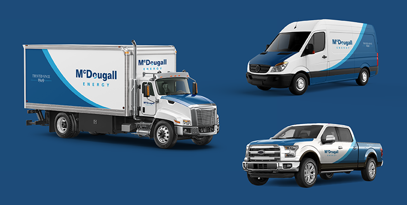
This project's focus was to create a fleet design for McDougall Energy Inc. Which would be used across all of their fleet vehicles. Read more
YEAR
2022
CLIENT
McDougall Energy Inc.
COMPANY
MYC Media
WHAT I DID
Brand Identity Design
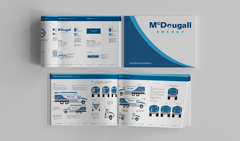
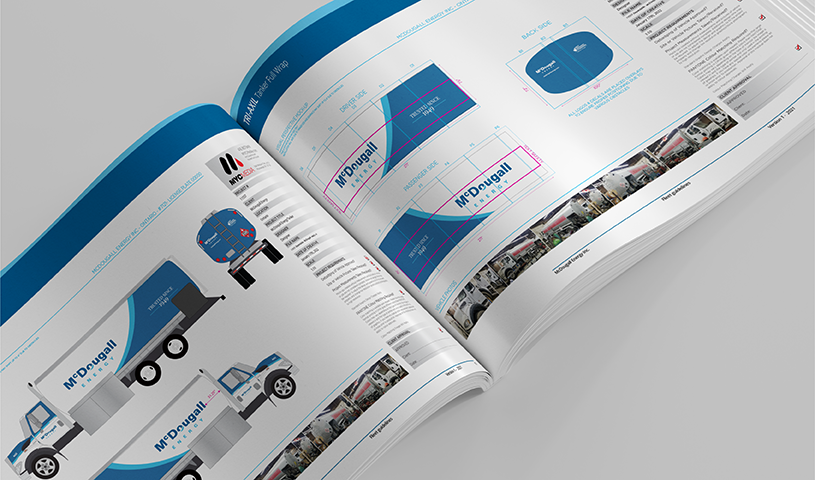
Fleet Guidelines
Editorial Design
Pre Press / Preflight

RATIONALE
McDougall Energy Inc. approached MYC Media to work with them on rebranding a fleet rebranding project. This was a year-long process in which we standardized their fleet vehicle graphics.
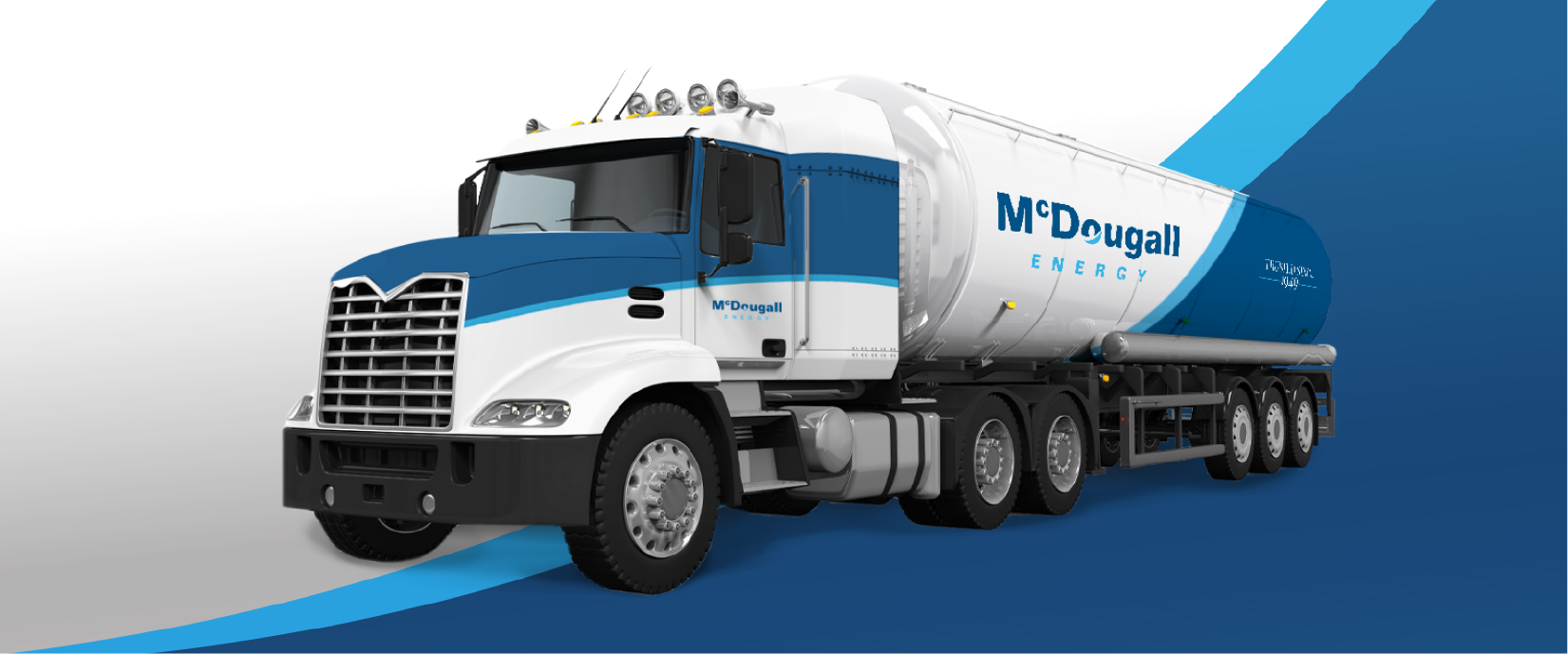
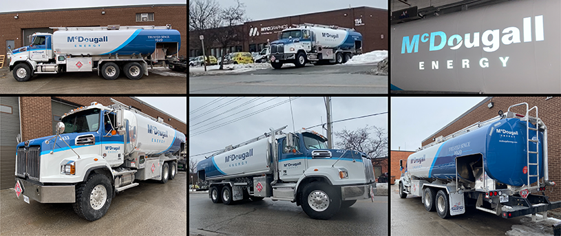
The majority of MEI’s vehicles are fuel tankers, which lead us to focus more on designing a fleet design for the tankers that could later be appropriated for the other vehicles in their fleet.
This project imposed a lot of challenges that were addressed throughout the design process. In the initial client meeting, they were broad with their brief, which led us to create various designs to narrow down the direction in which they would like to go with, for their fleet wrap. The company's brand identity had some restrictions on how the logo needed to be used on the vehicles, and also how the fleet graphics would work with the cobranding of the fuel that they carried, such as; Esso and Shell. However, the biggest challenge was to create a design that would suit the company's budget, when it came to the production and installation of the wraps.
At MYC Media, we also specialize in manufacturing and installation of the wrap designs that we create, which means that we would know how to set the print files, how to produce it and how to install it. Which gave us a unique perspective on pricing, time, installation and manufacturing.
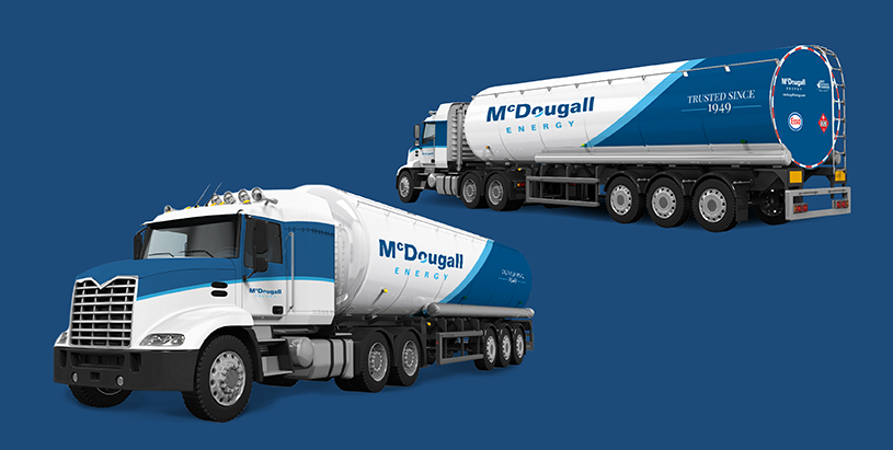
To create the final design for the fleet graphics, there were multiple concepts that were made; different patterns, repetition, water marks, images, 3D graphics, and finally the blue swoosh that became the base to the design. Which was a re-appropriation of the “O" in the McDougall Energy’s logo. Once the concept with the swoosh was approved, we began experimenting with taglines, icons, and various designs that could be incorporated into the design. The tagline “trusted since 1949” was the addition to the wrap that checked their boxes on the heritage element that they wanted implemented into this design.
In order to boost the visibility of the vehicles at night, the MEI logos in their vehicles are all made out of reflective vinyl. When light gets reflected on to the vinyl, the wrap reflects the light in which ever colour it was printed, giving a “glow” effect when light shines on it.
This project was a huge success, the design flows from vehicle to vehicle, allowing for successful fleet branding implementation, the vehicles carry the identity of the company, and reflect their modern values of always striving for newer solutions, and development. However, at the same time staying grounded in their history, and presenting themselves as trustworthy company.

