KIDKRAFT
PACKAGING
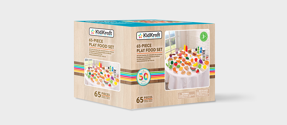
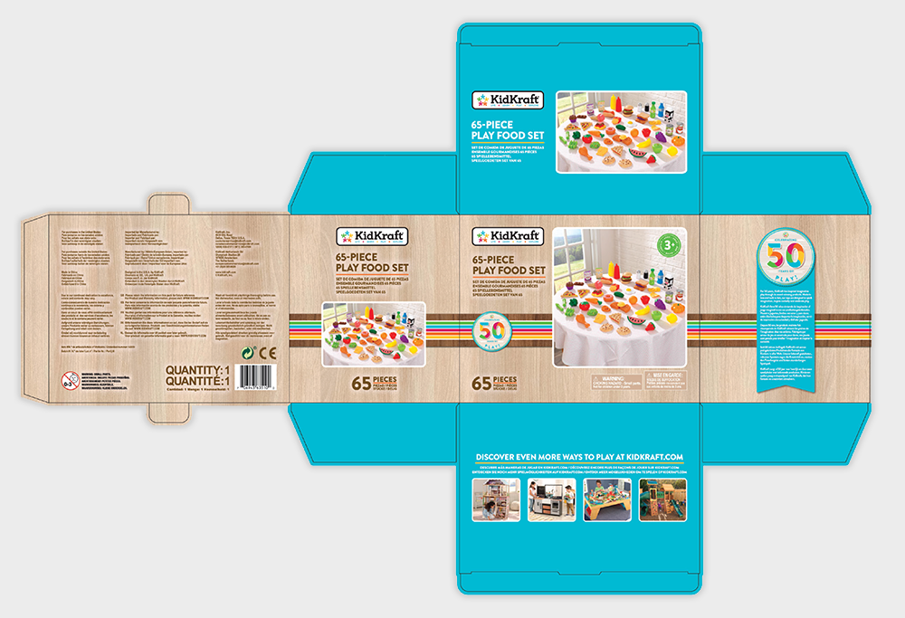
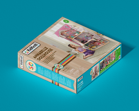
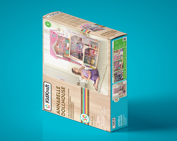
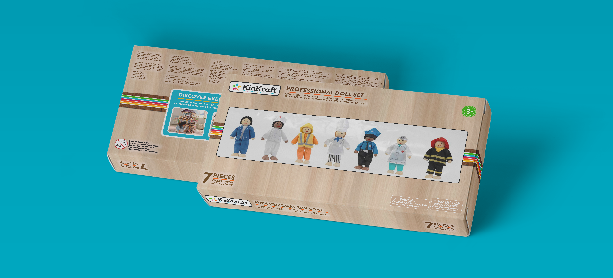
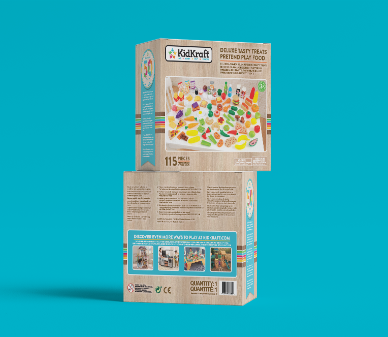
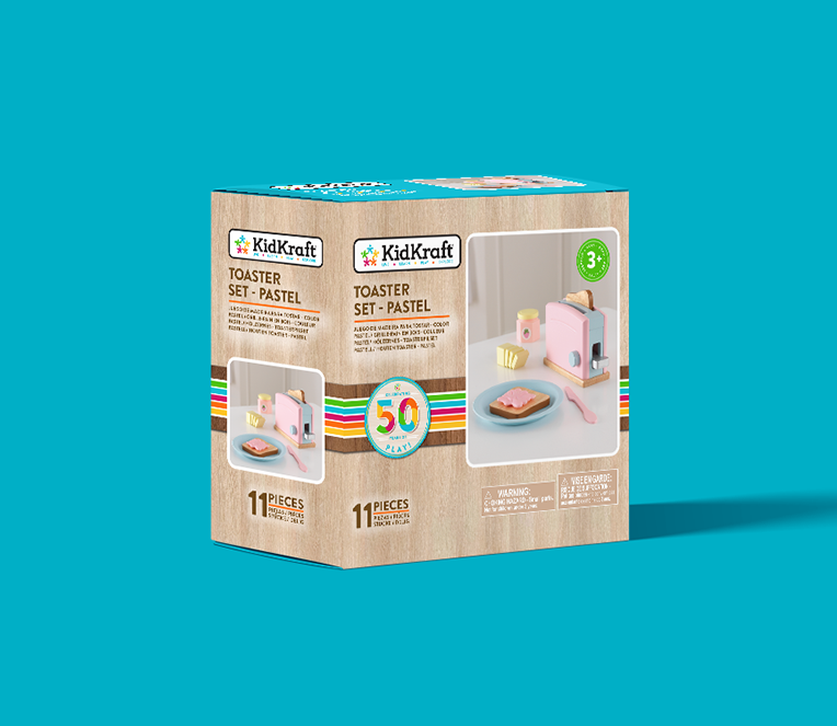
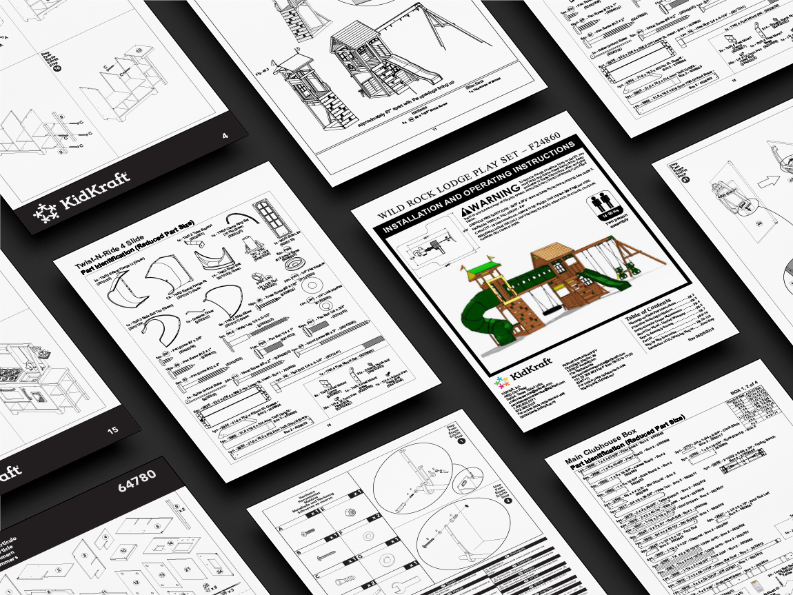
I worked at KidKraft’s Shenzhen, China office branch as an in-house Junior Graphic Designer intern, as part of their Graphic Design team. Read more
YEAR
2018—2019
CLIENT
KidKraft Inc.
COMPANY
KidKraft Inc.
WHAT I DID
Packaging Design
Editorial Design
RATIONALE
This was my college thesis project for the Graphic Design program at Niagara College. This project aimed to create an app where users could easily access survival information during various emergency situations.
The app would target ages 16 and up. The likely hood of one finding themselves in an emergency situation is higher when driving.
As the app would be used in less than ideal situations, the app has a friendly tone with an easy and straightforward interface. Though easy to follow instructions, this app will inform and instruct its users on basic survival skills. Aside from the virtual tool, the instructions within the app would have a printable PDF version that could be printed (prior to getting stranded) to be followed along in case the phone battery dies.
The QR code tags would play the sole purpose of helping promote the app. When a customer purchases a tent from a partner brand at a retail store, for example, attached to the tent cover, there would be this tag hanging from it. This allows the consumer to scan the QR code with their camera app and download it on the spot. In order for the consumer to get the benefit of the free app, they would need to get the code that’s hidden underneath the scratch bar that is on the tag (the same concept as a gift card)
To design the app, I wanted to incorporate a modern yet vintage in the sense that it gives an established feeling to the information being provided. The objective of the vintage inspiration was to mimic the feeling of trust/wisdom that one may have when reading an old book or to touch old furniture. The illustrations played the part of reflecting a vintage style while still looking simple enough to match the rest of the app.
The idea for the PDF instructions style was to pay homage to the style used in IKEA assembly instructions, simple, straightforward, and clean of unnecessary visuals/ graphics. The goal was to have a seamless transition from the app to the PDF, keeping the same structure (to its extent) to achieve a familiar feeling between the two assets.
The outcome of the project was a success. The graphics created to identify the app are carried through all mediums. Illustrations were consistent and straightforward, creating an easy-to-follow and unity. The app had a consistent look throughout all frames. The PDF version had a smooth transition from the app, keeping its format and style, allowing the user to navigate both mediums easily.

