PELLER
FAMILY
PACKAGING
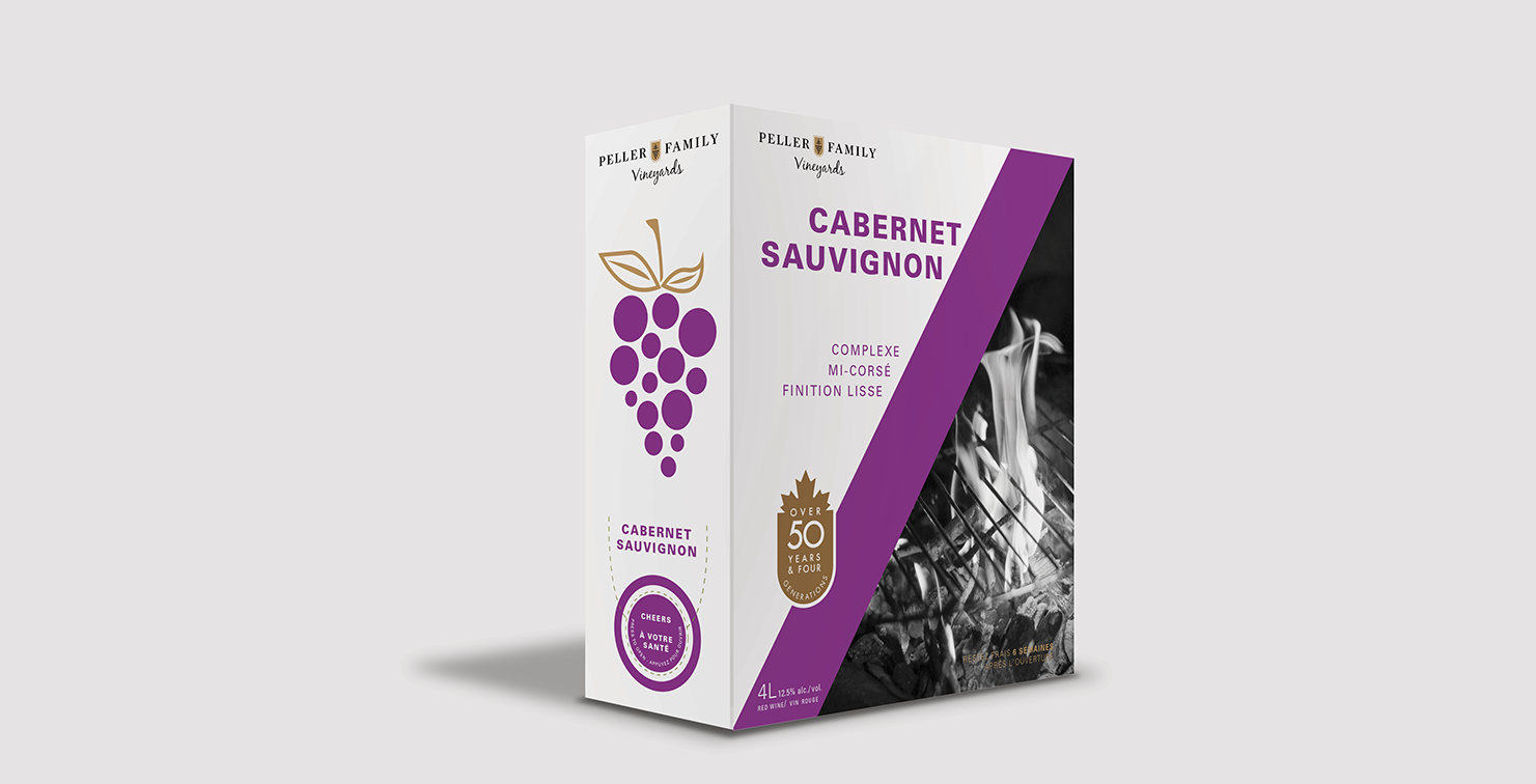
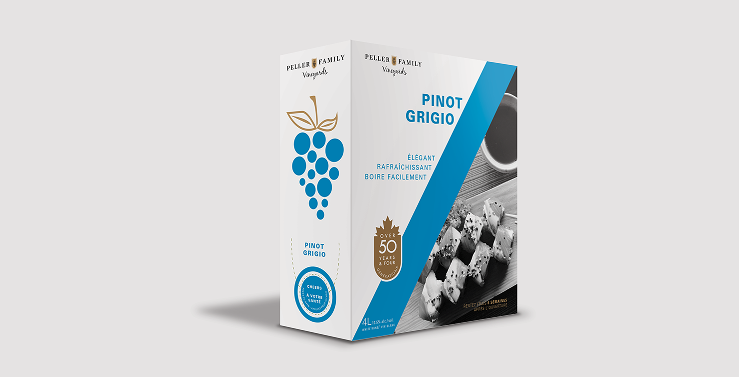
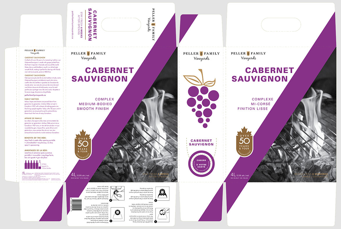
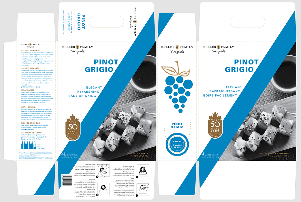
The objective of this project was to re-design a graphic packaging design concept for Peller Family Vineyards boxed wines. The goal was to create a modern and clean design. Read more
YEAR
2020
CLIENT
Peller Family Vinyards
[School Project]
COMPANY
Niagara College [Student]
WHAT I DID
Visual Design
Packaging Design
RATIONALE
Peller Family Vineyards is a Canadian winery crafting wine in their winery at Niagara-on-the-Lake. The objective of this project was to re-design a graphic packaging design concept for their boxed wines. The goal was to create a modern and clean design.
The target audience for Peller Family Vineyards is adults and seniors looking to enjoy wine with friends and family.
Design challenges relating to the Re-branding of the Peller Family’s packaging would be simplifying and portraying the same values that the brand stands for.
To design the packaging design concept for Peller Family’s boxed wines, with all of the design elements that are involved and necessary to create the visual identity, two pieces of software were used; Adobe Illustrator and Photoshop.
The outcome of the project was a success. The goal of re-branding the Peller Family’s packaging design was reached. The colour choice was based on the pre-existing colour scheme that was stipulated by the current packaging. The typeface choice was based on a modern and clean style to match the other design choices and elements. All of the design choices and strategies were made to accomplish a simple and modern packaging identity.

