70
BELOW
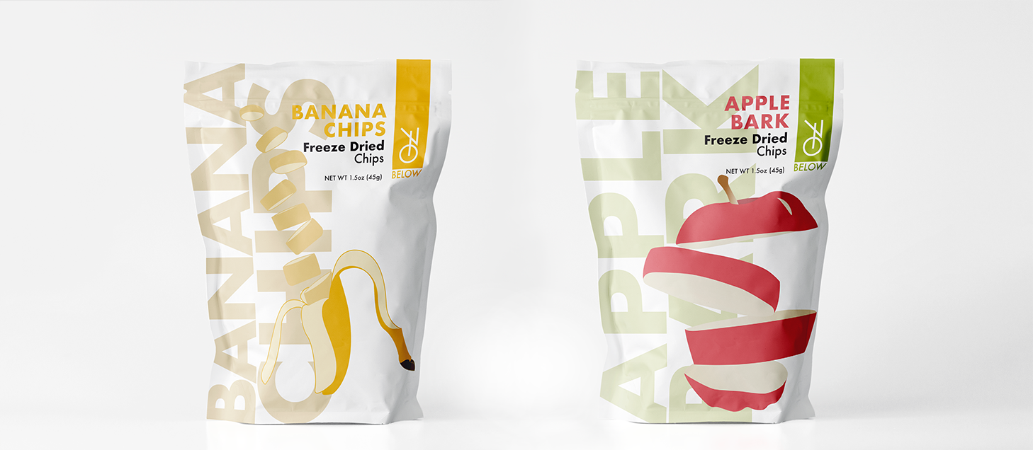
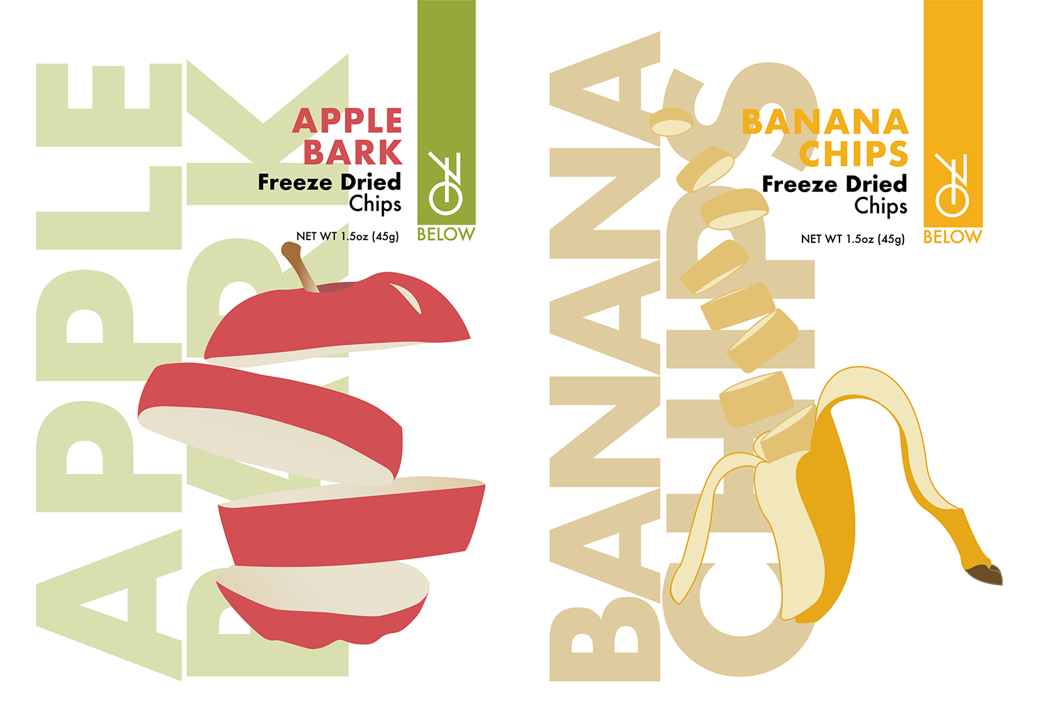
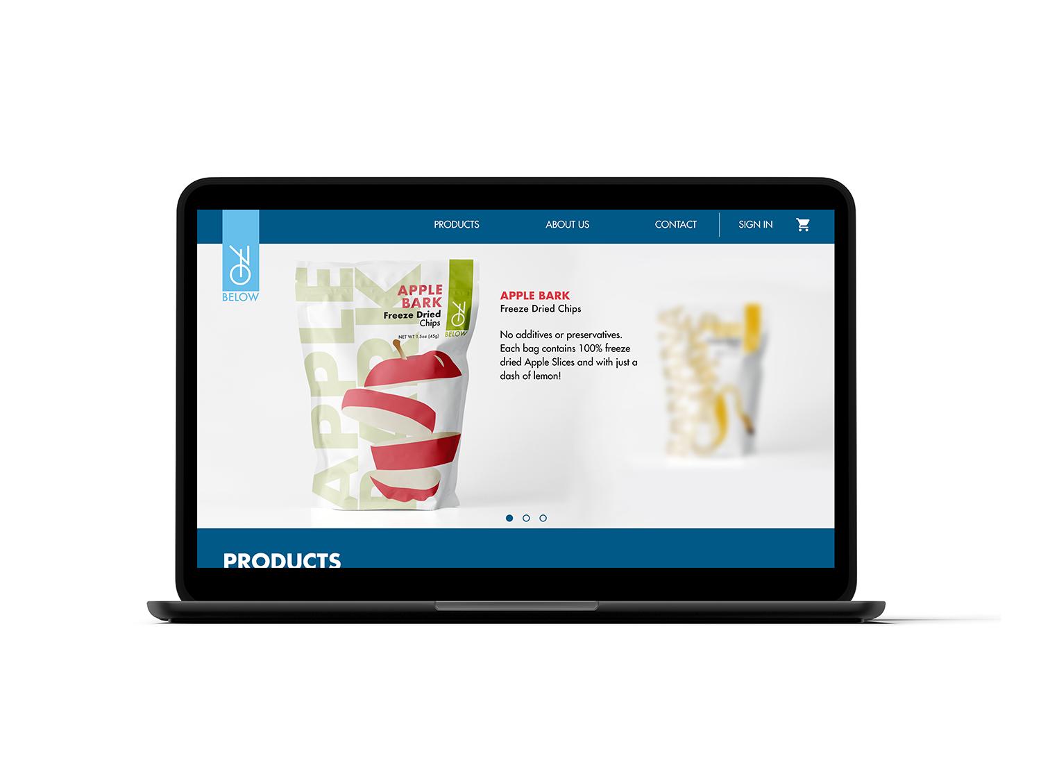
This project was part of a design Aton organized by Niagara College's Graphic Design Program. The objective was to rebrand the company 70 Below, which would include a new logo, a new packaging design and a revamped website. Read more
YEAR
2020
CLIENT
70 Below
[Design Aton]
COMPANY
Niagara College [Student]
WHAT I DID
Brand Identity Design
Packaging Design
UI Design


RATIONALE
70 below is a company that makes and sells; healthy freeze-dried snacks and pet treats that are Ontario grown. The objective of this project was to re-design a graphic packaging design for 70 Below during the design Aton held by the Niagara College Graphic Design program. The goal was to work in pairs to create a rebrand for 70 below in one day.
The target audience for 70 Below is youth and adults that are looking for healthy snack alternatives.
Design challenges relating to the rebranding of 70 Below would be the time span in which we had to complete the brand identity.
To design the brand identity for 70 Below, with all the design elements involved and necessary to create the visual identity, a few pieces of software were used; Adobe Illustrator, Photoshop, and Figma.
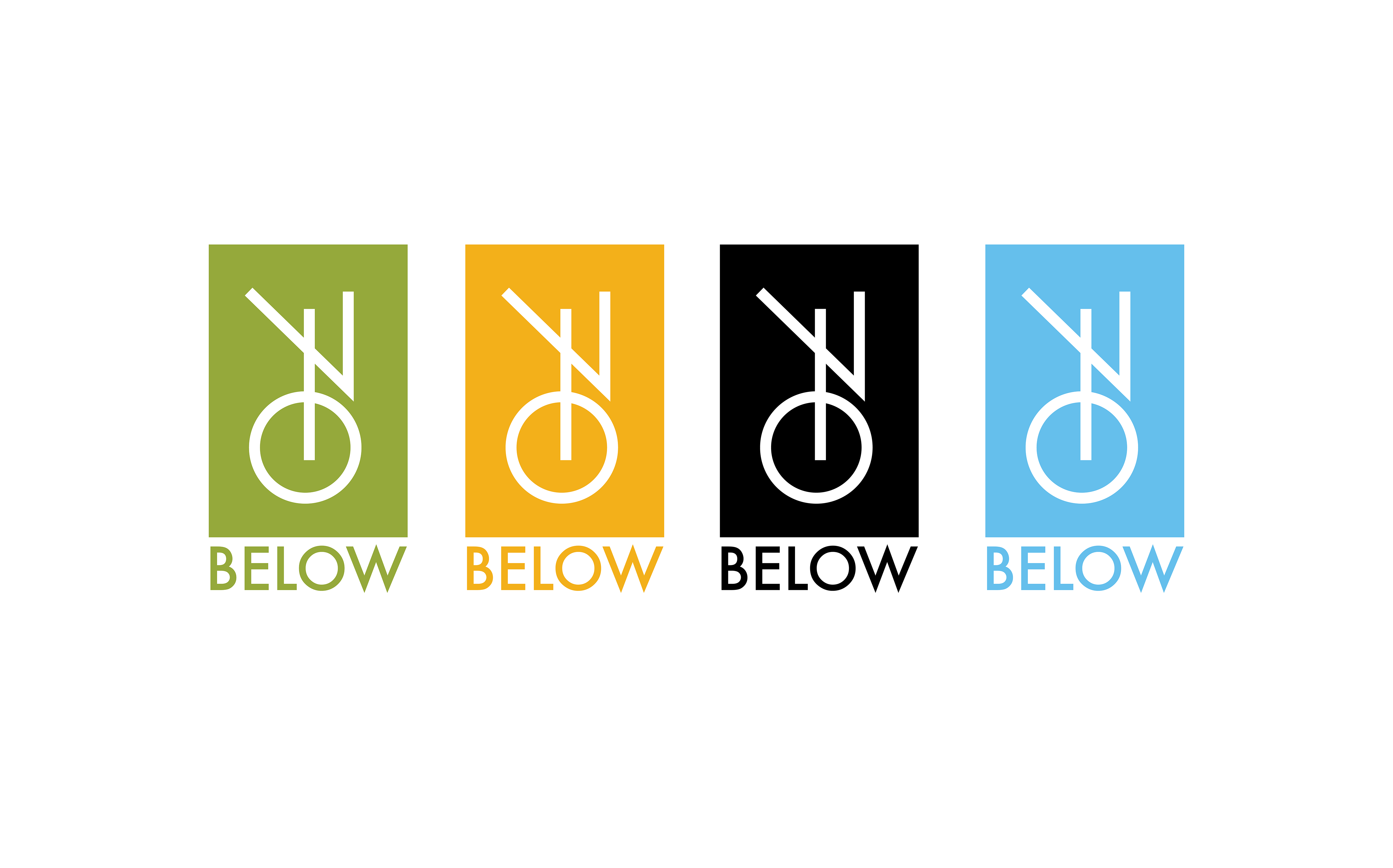
The outcome of the project was a success. The goal of rebranding 70 Below was reached by the end of the event. The colour choice was based on the product being sold. The logo has a modern and clean style, making it look current and established. The typeface choice was based on a modern and simplistic style to match the other design choices and elements. All of the design choices and strategies were made to accomplish a simple and modern visual identity.